
Turbo Rails Tutorial を Rails 7.2.1 / ruby 3.3.5 / Dev Container / tailwindcss でやってみた (3)
前回の続き です。Dev Container と tailwindcss を利用して Turbo Rails Tutorial をやっています。
前回までソースコードは takaokouji/quote-editor:a84cf9e にあります。
環境
- Apple M3 (MacBook Air 13 2024)
- macOS Sonoma 14.6.1
- Visual Studio Code 1.93.0
- Dev Container 機能拡張をインストール済み
- Homebrew
- ruby 3.3.5
- rails 7.2.1 gem
gem install rails
- mysql 9.0.1
brew install mysql
- zstd 1.5.6
brew install zstd
- mysql2 0.5.6 gem
gem install mysql2
ruby-lspの導入
本題に入る前に、前回、コーディングスタイルの問題で quote-editor の CI (GitHub Actions) が失敗しました。そこで、プログラムするタイミングで rubocop を実行するようにして GitHub に push する前にコーディングスタイルの問題を解決できるようにします。
.vscode/settings.json の修正内容。
{
  "rubyLsp.formatter": "rubocop",
  "[ruby]": {
    "editor.defaultFormatter": "Shopify.ruby-lsp",
    "editor.formatOnSave": true
  }
}
.devcontainer/devcontainer.json の修正内容。変更点のみです。ついでに tailwindcss 用の拡張機能も追加しています。
  "customizations": {
    "vscode": {
      "extensions": [
        "Shopify.ruby-lsp",
        "bradlc.vscode-tailwindcss"
      ]
    }
  },
それと 【DevContainers】fatal: detected dubious ownership in repositoryの対処法 を参考にして git の権限がない問題にも対応しておきます。
"postCreateCommand": "sudo git config --system --add safe.directory ${containerWorkspaceFolder} && bin/setup"
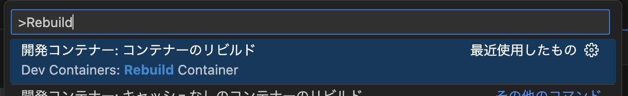
コンテナをリビルドして作業再開。本当は必要ないのでしょうけど、devcontainer.jsonを修正したらリビルドしておくと安心です。
Organizing CSS files in Ruby on Rails
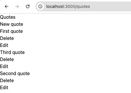
今回はこんな感じの Web 1.0 な残念なページに CSS を適用して Web 2.0 にグレードアップさせます。
Turbo Rails Tutorial では1からCSSを記述しています。説明はとてもわかりやすく、それに、完成したページのデザインも良いです。
それでも、単に使ってみたいからというすごく個人的な理由で、tailwindcss を使って同じような見た目にします。実は tailwindcss を使ったことがないため、ちょっと不安です。が、なんとかなるでしょう。
それでは順番にやっていきましょう!
色の定義
app/assets/stylesheets/config/_variables.scss はいろいろな CSS 変数の定義です。これらの多くは tailwindcss が提供しているため不要です。ただ、フォントとカラーについてはなるべく同じデザインにするため、設定ファイル tailwind.config.js で定義します。
/** @type {import('tailwindcss').Config} */

const colorTextHeader = 'hsl(0, 1%, 16%)';

module.exports = {
  content: [
    './app/views/**/*.html.erb',
    './app/helpers/**/*.rb',
    './app/assets/stylesheets/**/*.css',
    './app/javascript/**/*.js'
  ],
  theme: {
    fontFamily: {
      sans: [
        'Lato', '-apple-system', 'BlinkMacSystemFont', 'Segoe UI', 'Roboto', 'Oxygen', 'Ubuntu', 'Cantarell', 'Open Sans',
        'Helvetica Neue', 'sans-serif'
      ]
    },
    colors: {
      transparent: 'transparent',
      current: 'currentColor',

      // Three different text colors
      'text-header': colorTextHeader,
      'text-body':   'hsl(0, 5%, 25%)',
      'text-muted':  'hsl(0, 1%, 44%)',

      // Application colors
      primary:          'hsl(350, 67%, 50%)',
      'primary-rotate':   'hsl(10, 73%, 54%)',
      'primary-bg':       'hsl(0, 85%, 96%)',
      secondary:        'hsl(101, 45%, 56%)',
      'secondary-rotate': 'hsl(120, 45%, 56%)',
      tertiary:         'hsl(49, 89%, 64%)',
      glint:            'hsl(210, 100%, 82%)',

      // Neutral colors
      white:      'hsl(0, 0%, 100%)',
      background: 'hsl(30, 50%, 98%)',
      light:      'hsl(0, 6%, 93%)',
      dark:       colorTextHeader
    }
  }
}
リセット
app/assets/stylesheets/config/_reset.scss は重要そうなところだけを tailwindcss で定義。具体的にはブラウザのデフォルト値をリセットしている margin: 0 などは定義せず、フォントカラーなどの見た目を変えるものを定義。
チュートリアルのCSSとの違いは @apply ディレクティブ を使って tailwindcss が定義しているクラスを記述する。現時点ではファイルの分割方法がわからないため、直接 app/assets/stylesheets/application.tailwind.css を変更します。
修正前の app/assets/stylesheets/application.tailwind.css は次の3行です。
@tailwind base;
@tailwind components;
@tailwind utilities;
これに次の内容を追記します。
html {
  @apply overflow-y-scroll h-full;
}

body {
  @apply flex flex-col min-h-full bg-background text-text-body leading-normal font-sans;
}

img,
picture,
svg {
  @apply block max-w-full;
}

h1,
h2,
h3,
h4,
h5,
h6 {
  @apply text-text-header leading-tight;
}

h1 {
  @apply text-3xl;
}

h2 {
  @apply text-2xl;
}

h3 {
  @apply text-xl;
}

h4 {
  @apply text-lg;
}

a {
  @apply text-primary no-underline transition-colors duration-200
    hover:text-primary-rotate focus:text-primary-rotate active:text-primary-rotate;
}
チュートリアルのフォントサイズと tailwindcss の対応は以下でした。
- –font-size-xs: 0.75rem; // 12px
- text-xs
- –font-size-s: 0.875rem; // 14px
- text-sm
- –font-size-m: 1rem; // 16px
- text-base
- –font-size-l: 1.125rem; // 18px
- text-lg
- –font-size-xl: 1.25rem; // 20px
- text-xl
- –font-size-xxl: 1.5rem; // 24px
- text-2xl
- –font-size-xxxl: 2rem; // 32px
- text-3xl
- 厳密には対応するものがなかった
- –font-size-xxxxl: 2.5rem; // 40px
- text-4xl
- 厳密には対応するものがなかった
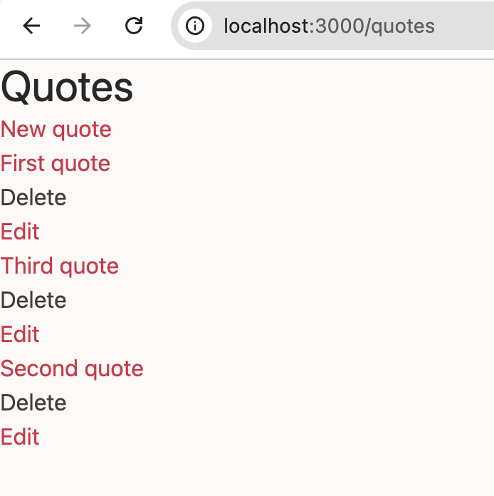
ここまでの成果。ちょっと色がついて、隙間が空いた。
ボタン
次はボタン .btn のスタイルを定義します。チュートリアルの app/assets/stylesheets/components/_btn.scss 相当です。.btn はコンポーネントとして定義すると良さそうなので @layer ディレクティブ を使います。
/* 省略 */
@layer components {
  .btn {
    @apply
      inline-block
      py-1.5 px-4
      rounded-md
      bg-origin-border
      bg-transparent
      border-solid border-2 border-transparent
      font-bold
      no-underline
      cursor-pointer
      outline-none
      [transition:filter_400ms,color_200ms]
      hover:[transition:filter_250ms,color_200ms]
      focus:[transition:filter_250ms,color_200ms]
      focus-within:[transition:filter_250ms,color_200ms]
      active:[transition:filter_250ms,color_200ms];
  }

  .btn--primary {
    @apply text-white bg-gradient-to-r from-primary to-primary-rotate
      hover:text-white hover:saturate-[1.4] hover:brightness-[115%]
      focus:text-white focus:saturate-[1.4] focus:brightness-[115%]
      focus-within:text-white focus-within:saturate-[1.4] focus-within:brightness-[115%]
      active:text-white active:saturate-[1.4] active:brightness-[115%];
  }

  .btn--secondary {
    @apply text-white bg-gradient-to-r from-secondary to-secondary-rotate
      hover:text-white hover:saturate-[1.2] hover:brightness-[110%]
      focus:text-white focus:saturate-[1.2] focus:brightness-[110%]
      focus-within:text-white focus-within:saturate-[1.2] focus-within:brightness-[110%]
      active:text-white active:saturate-[1.2] active:brightness-[110%];
  }

  .btn--light {
    @apply text-dark bg-light
      hover:text-dark hover:brightness-[92%]
      focus:text-dark focus:brightness-[92%]
      focus-within:text-dark focus-within:brightness-[92%]
      active:text-dark active:brightness-[92%];
  }

  .btn--dark {
    @apply text-white border-dark bg-dark
      hover:text-white
      focus:text-white
      focus-within:text-white
      active:text-white;
  }
}
チュートリアルのスペース(パディングやマージン)のサイズと tailwindcss のサイズの対応は以下でした。ここには数値しか記載していませんが、例えば 1 だと m-1, p-1 みたいに指定します。
- –space-xxxs: 0.25rem; // 4px
- 1
- –space-xxs: 0.375rem; // 6px
- 1.5
- –space-xs: 0.5rem; // 8px
- 2
- –space-s: 0.75rem; // 12px
- 3
- –space-m: 1rem; // 16px
- 4
- –space-l: 1.5rem; // 24px
- 6
- –space-xl: 2rem; // 32px
- 8
- –space-xxl: 2.5rem; // 40px
- 10
- –space-xxxl: 3rem; // 48px
- 12
- –space-xxxxl: 4rem; // 64px
- 16
最初、 .btn を追加したのに生成した css にはその定義が含まれていませんでした。おかしいなと思って、 bin/dev を control-C でいったん止めてから、再度 bin/dev でサーバーを起動すると修正が反映されました。その後はサーバーの再起動なしで変更が即座に反映されています。なんだったのだろう…。
また、 transition の指定に四苦八苦しました。特に transition: filter 400ms, color 200ms; を tailwindcss でどのように表現すればいいのかわかりませんでした。が、わかってみれば [] で括れば自由に CSS を書けることがわかり、それをつかって実現しました。
なお、tailwindcss では CSS 入れ子 (CSS nesting) は使えませんでした。残念。
/* 現時点ではこれはダメな書き方 */
a {
  @apply text-primary no-underline [transition:filter_450ms,color_200ms];

  &:hover,
  &:focus,
  &:active {
    @apply text-primary-rotate;
  }
}
tailwindcss/nesting というプラグインと PostCSS を導入するとそれっぽい記述ができるようになるようなのですが、現時点ではプラグインを入れずに作業を進めたかったので & を愚直に展開して対応しました。
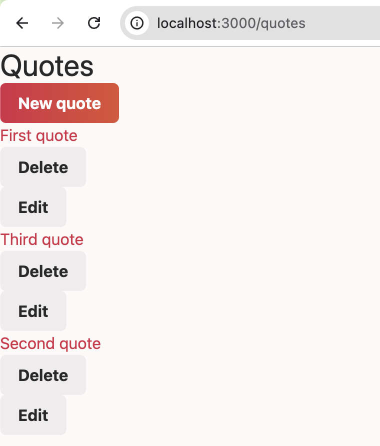
ここまでの成果。ボタンのグラデーションがかっこいい。こういったセンスを身につけたい。
見積もり (Quote)
メインコンテンツの見積もり (Quote) のスタイルを定義します。チュートリアルの app/assets/stylesheets/components/_quote.scss 相当です。
/* 省略 */
@layer components {
  /* 省略 */

  .quote {
    @apply flex justify-between text-center items-center gap-3 bg-white rounded-md shadow-sm mb-4 p-2
      md:py-2 md:px-4;
  }

  .quote__actions {
    @apply flex flex-[0_0_auto] gap-2 self-start;
  }
}
tailwindcss では flex: 0 0 auto; に対応する flex-[0_0_auto] という書き方ができるのが強み。事前に定義してあるものだけでなく、必要ならその場で定義できるのは楽。
ここまでの成果。一気にそれっぽいデザインになった。すごい。
フォーム
前回、 simple_form の設定をスキップしたのですが、やはり必要だったのでこのタイミングで設定します。
SimpleForm.setup do |config|
  config.wrappers :default, class: "form__group" do |b|
    b.use :html5
    b.use :placeholder
    b.optional :maxlength
    b.optional :minlength
    b.optional :pattern
    b.optional :min_max
    b.optional :readonly
    b.use :label, class: "visually-hidden"
    b.use :input, class: "form__input", error_class: "form__input--invalid"
  end

  config.default_wrapper = :default
  config.boolean_style = :nested
  config.button_class = "btn"
  config.error_notification_tag = :div
  config.error_notification_class = "error_notification"
  config.label_text = lambda { |label, _, _| label }
  config.generate_additional_classes_for = []
  config.browser_validations = false
  config.boolean_label_class = "form__checkbox-label"
end
設定後は bin/dev を再起動します。
そして、フォームのスタイルを定義します。チュートリアルの app/assets/stylesheets/components/_form.scss と app/assets/stylesheets/components/_visually_hidden.scss 相当です。
  /* 省略 */

  .form {
    @apply flex flex-wrap gap-2;
  }

  .form__group {
    @apply flex-1;
  }

  .form__input {
    @apply block w-full max-w-full py-1.5 px-2 border-solid border-2 border-light rounded-md outline-none
      transition-shadow duration-200
      focus:[box-shadow:0_0_0_2px_theme(colors.glint)];
  }

  .form__input--invalid {
    @apply border-primary;
  }

  /* Shamelessly stolen from Bootstrap */

  .visually-hidden {
    @apply !absolute !w-px !h-px !p-0 !-m-px !overflow-hidden ![clip:rect(0,0,0,0)] !whitespace-nowrap !border-0;
  }
}
[] で括って 任意の値 (arbitrary value) を指定する際、theme関数 を使って theme(colors.glint) のようにして定義したカラー glint を参照しています。
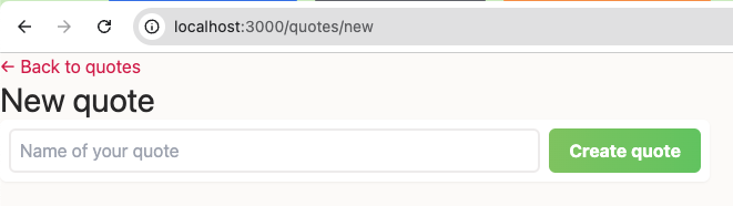
ここまでの成果。一覧に続いて、新規登録画面のデザインもいい感じになりました。
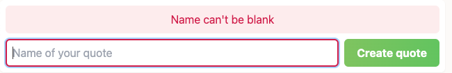
エラーメッセージ
エラーメッセージのスタイルを定義します。チュートリアルの app/assets/stylesheets/components/_error_message.scss 相当です。
  /* 省略*/

  .error-message {
    @apply w-full text-primary bg-primary-bg p-2 rounded-md;
  }
}
で、こんな感じ。
コンテナ
チュートリアルの app/assets/stylesheets/layouts/_container.scss 相当です。
  /* 省略*/

  .container {
    @apply w-full pr-2 pl-2 ml-auto mr-auto md:pr-4 md:pl-4 md:max-w-[60rem];
  }
}
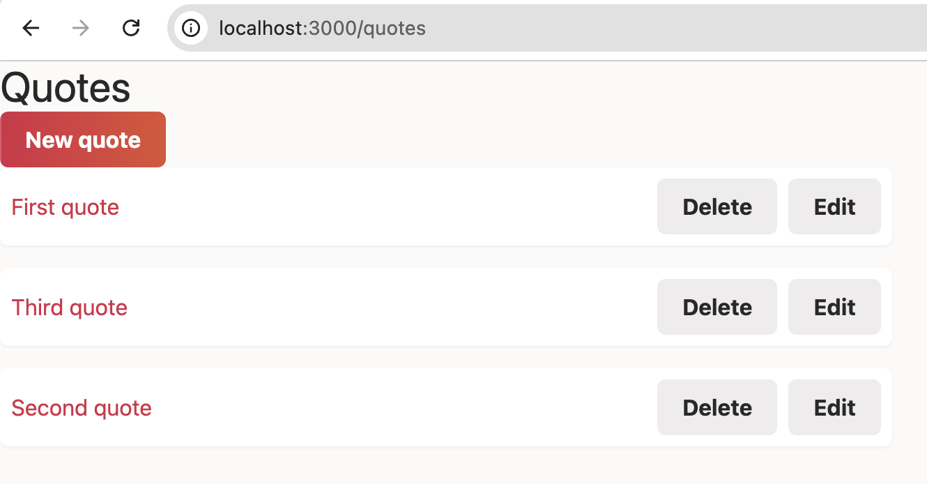
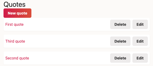
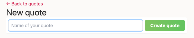
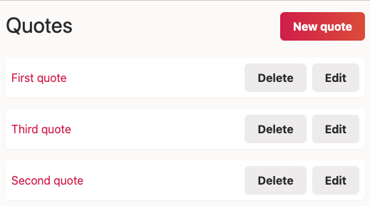
一覧画面。
新規作成画面。
ヘッダー
チュートリアルの app/assets/stylesheets/layouts/_header.scss 相当です。
  /* 省略*/

  .header {
    @apply flex flex-wrap gap-3 justify-between mt-4 mb-6 md:mb-8;
  }
}
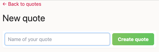
一覧画面。
新規作成画面。
1ファイルにすべてのスタイルに定義したため manifest ファイルはそのままでいいです。
お疲れ様でした。これで完成です。
今回はここまで。
初 tailwindcss でしたが、これは便利。通常、フロントエンドは HTML + CSS + JavaScript で作るのですが tailwindcss を使えば CSS を引き算して HTML + JavaScript でできそう。
また、@import が使えないのが不安でしたが、なんとかなりましたね。 PostCSS を使えば @import が使えたり、入れ子 CSS 相当のことができたりするようなので、次回はそれにチャレンジしようと思います。
ソースコードは takaokouji/quote-editor においていますので、興味がある方は Watch していただけると励みになります。
協力者の募集
スモウルビー (GitHub) の開発にご協力いただける方を常に募集しています。
ご協力いただける方は、 contact@smalruby.jp までご連絡いただいてもいいですし、連絡なしで「xxx のブロックに対応しました」というPRを作成してもらってもかまいません。むしろその方が好都合です。スポンサーも募集しています。
また、 拙著:小学生から楽しむ きらきらRubyプログラミング をご購入いただけるとありがたいです。スモウルビーの使い方と教え方を学ぶことができる書籍です。特に小・中学校の先生に読んでいただきたいです。

日本中の小・中学生が学校の授業や地域のプログラミング教室でスモウルビーを使っています。みなさんのご協力で、たくさんの子どもたちがハッピーになります。ご協力、よろしくお願いします。